Top Colors for a Pharmacy
 Pharmacy Colors
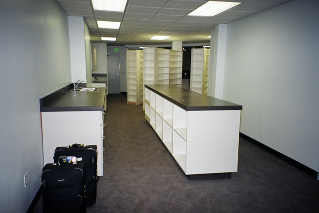
No commercial design is more challenging than that of the pharmacy. Pharmacies must maintain strict cleanliness at all times, while at the same time walking a tight rope of confidence, professionalism, and friendliness. Pharmacies must both look sterile and be sterile, with a clinical environment, but retail pharmacies must also simultaneously focus on the patient experience. In today's healthcare industry, all healthcare providers are targeting the best possible patient experience that can be achieved, and this means constantly cultivating welcoming surroundings. It's this delicate balance between the professional world of the pharmacist and the customer service world of the patient that makes designing the right commercial space for a pharmacy a challenging endeavor. And this means that finding the right paint color combination for both retail and hospital pharmacies is vital.
Naturally, clean rooms must meet strict regulations in order to be compliant. Design in the rest of the pharmacy is more challenging simply because there are no rigorous guidelines, making its designs up for grabs. Every bit of a pharmacy, however, must remain as sterile as possible at all times, and that means the look and feel must also maintain the highest levels of cleanliness and professionalism. Pharmacy designs do not have the same latitude as, say, hospital or private practice waiting areas, simply because medications are constantly being distributed. This means that a professional and clinical atmosphere must always be maintained. However, it is fine to add a friendly touch to a pharmacy, especially if the commercial space is in a retail store rather than in a hospital. Any area where customers will enter and purchase medications should have an inviting feel to it, and that's why some paint colors used in a pharmacy are good while others are not.
The traditional colors of pharmacies have always been green and white. Typical pharmacy symbols have always appeared in green and white color schemes, but this doesn't mean that this color combination must always be carried over into the pharmacy itself. After the clinical and sterile aspects of the pharmacy are considered, the level of activity should be a factor. If the commercial space of the pharmacy sees a lot of customer enterprise, bright colors can be suitable for the walls and decor of the pharmacy, as long as they maintain the clinical aspects as well. Bright yellows mixed with whites can work very well in a pharmacy. Bright oranges, too, can work in a pharmacy that sees lively activity. For that matter, all primary colors and secondary colors that are vivid and bright can be used to a pharmacy's advantage, since vivid colors tend to feel more crisp and clean. Creating a color palette with rich, radiant colors that combine with stark white will add a personal touch to a pharmacy yet still maintain its ambient purity.
Hospital pharmacies can be a different story, especially if they don't get a lot of foot traffic from customers. White is always a proper color to paint networks and units of hospital pharmacies, since most or all of the people visiting the pharmacy will be coming from hospital staff. It's not necessary to stress about the paint colors of a hospital pharmacy if customers won't be serviced. If, however, a more friendly atmosphere is still desired in a hospital pharmacy, try whites combined with other colors used in the hospital rooms surrounding the pharmacy. Soft yellows and blues incorporated with a main white can create a softer atmosphere while still maintaining the crisp cleanliness necessary in a pharmacy.
The most important aspects of all pharmacies, both hospital and individual retail, are cleanliness and sterility. Maintaining a clinical environment is vital to the mixing, dispensing, and distribution of medications. For this reason, choosing the right color palette for your pharmacy can be a difficult decision. If a pharmacy is painted the wrong colors, the clinical integrity will be lost, and a polluted as well as confusing environment will be created. Commercial contractors are skilled at choosing the right color combination vital to achieving the right look and feel of every commercial design. Contact an experienced commercial contractor in Seattle for information on attaining the perfect colors for your pharmacy.
