Top Medical Office Colors
 Colors for a Doctors Office
Color has always had an impact on human emotions and outlook. Like the sense of smell, each color has the power to evoke a different feeling and influence perception. Some bright colors awake excitement and energy, while other muted hues evoke feelings of calm and serenity. That's why color is such an important part of the medical office in design Bellevue. Patients want to feel confident about your practice, and they want to feel as calm as possible. In many instances, visiting the doctor is tough enough without feeling more nervous or agitated than when you walk through the door of a physician's office. The color palette your medical office displays has the power to make or break the patient experience. For this reason, medical office remodeling has become as important to the medical profession as medical equipment itself.
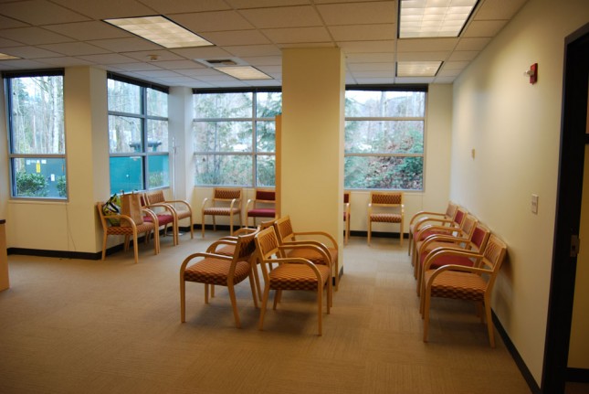
Waiting and reception areas
A patient's first impression of your practice is synonymous with the first impression they get from your office. Naturally, when creating the perfect patient experience, the color scheme will be impactful and significant. This year, medical office design colors are trending toward soft but lively. Yellows and oranges are perfect colors that have shades and tints with the power to simultaneously brighten a patient's mood as well as create a calming effect. Blues and greens are also huge this year, especially as their softer, more muted tints have the ability to calm rapid heart rates. Dark blues are phasing out, as these tend to be colder and evoke feelings of melancholy that aren't welcome in a doctor's office setting. However, because blue is a color that is most associated with honesty and sincerity, lighter shades of blue are big in medical office settings this year and are expected to be widely used into the next.
Exam rooms
Examination areas need to look and feel clean, but they also need to be functional for healthcare professionals as well as comfortable for patients. For this reason, color palettes chosen for exam rooms can be a little more challenging. Patients still tend to feel a little uncomfortable with the abruptness of a shocking white, but ivories and light versions of beige are trending big in exam rooms this year because they instill comfort while still remaining crisp and illuminating. Again, soft yellows and even softer, more muted tones of orange are trending this year for exam rooms because they feel warm, but aren't scary like the old standby whites. Pastels are also on the rise in modern medical office exam rooms because they are soothing and functional all at the same time.
Children's areas
Not all doctors' offices have them, but more are trending toward medical office remodels that add in separate areas in waiting rooms for children. A separate area of a waiting room where parents can take their children so they can play and keep their minds off being seen by the doctor is becoming a very important part of the medical office setting. Color schemes in these areas are trending in several directions, from hues that wouldn't normally be used in adult waiting areas, such as primary colors of yellows and reds, as well as softer pastels in whimsical pinks and purples. In some cases, child-sized furniture is provided so kids can relax and play in full view of parents.
Colors have a subliminal effect on everyone, and that's why they play a very important role in the design of the modern medical office. Cold, stark colors make for a cold office, and that means your patients are going to feel unwelcome and uncomfortable. Warm, soft colors make for an inviting, pleasant office that tells your patients they've come to a place where they'll be treated with kindness and consideration. Today's paint colors used in medical offices are trending toward all things calming and soothing, but still with an air of confidence and control. For more information on how paint color trends can affect positive experience for your patients, contact a commercial contractor in your area. After all, the first impression your patients get of your medical office is as important as the examination itself.
