Neutral Colors in Doctors Offices
 Color Trends
One of the biggest trends in medical office design today is going back to the classics, and that's why neutral colors are making a huge comeback. There was a time when using neutral colors in doctors' offices and hospitals was done to give a sterilized feel. The problem with that was that 'sterilized' often felt 'sterile.' It made people feel uneasy. Going to the doctor creates enough anxiety. The fact is that there's just no need to have a decor in your practice that adds to patient angst. Today's medical office design is about creating calm as well as eliciting a soothing effect for patients, and neutral colors are a big part of that trend. Combining neutrals with standout patterns, opting for modern neutrals, and even pairing neutral colors with a little bit of another shade or tint ... these are all commercial remodeling trends that can add artistry to your practice, while maintaining a professional appearance and feeling.
Pleasant patterns
Giant polka dots, big pink daisies, modern dripping stripes, or abstract art ... these kinds of patterns probably aren't the look, or more important, the feel, you're going for in your medical office remodel. There are, however, many choices in patterns that, when combined with soft neutral classics, will help to make your office beautiful and soothing, rather than barren and sterile. Herringbone, paisley, fleur-de-lis ... these are all lovely, classic patterns that will add style to your doctors' office without being too bold or whimsical. Soft animal prints and other organic patterns, if done well and done right, can also add variety and personality, while still promoting calm and confidence. Try adding in some texture for an extra layer of style without ruining the effects of soft patterns and soothing neutrals.
New-trals
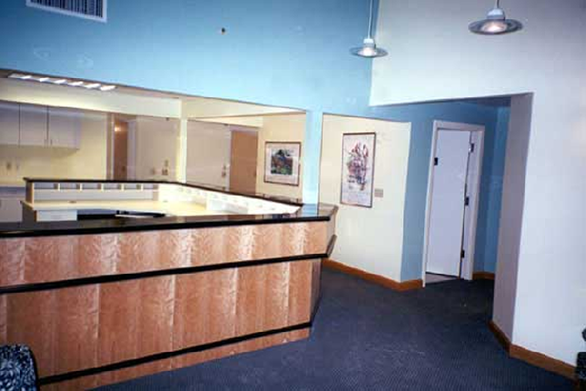
Just this year, Benjamin Moore introduced their 'new neutrals' in paint colors. Included in this gallery are dreamy blues, ethereal sage greens, and soft roses and peaches that can add just a touch of color, while still upholding the respectability and certainty you need in your office. Combine any of these new neutrals with softer patterns, and you've got a medical office design that is beautiful, functional, and stylish without feeling empty. This year's 'color of the year' is 'breath of fresh air' by Benjamin Moore, and it's perfect for a doctors' office, keeping in ideal alignment with this neutral color trend. Light, lovely, and low-key, this soft hue is perfectly combined with any of the other new (or even classic) neutrals. The idea for the twist on neutral classics is basic and calming, but with added creativity. And if you're a fan of nature, incorporating these neutrals with other organics couldn't be more perfect in your office for enhancing the artistic while creating serenity.
Comfortable, classic combos
Right about now you're probably coming up with some really great ideas for your commercial office remodeling project. But don't be afraid to add a soft splash of color with neutrals in order to bring some of your own personality into your medical office. In fact, a big trend in medical office design that patients are looking for now more than ever is a touch of their healthcare professional's personality accompanying all that functionality. Analogous colors (colors that are next to each other on the color wheel) make a great combination with neutrals for augmented elegance combined with added harmony. And, still today, nothing beats white for a doctors' office. Its clean, crispness fused with any other neutral, be it classic or modern, is still the perfect standby for every physician's office. Classic for a reason, white is the perfect complement to every other hue on the color wheel, and that's why it's a trend that never goes out of style, especially in medical office design.
Chances are pretty good that your patients are already nervous about coming into your office. After all, there aren't too many people who relish going to the doctor. The job of your medical remodeling project is to put your patients at ease before you examine them. A medical office that helps to calm patients has a two-fold effect: it puts patients at ease, and that makes them so much more comfortable about being examined by you. Contact a commercial remodeling contractor in Seattle who can show you how neutral colors will reassure your patients as soon as they walk into your office.
Pleasant patterns
Giant polka dots, big pink daisies, modern dripping stripes, or abstract art ... these kinds of patterns probably aren't the look, or more important, the feel, you're going for in your medical office remodel. There are, however, many choices in patterns that, when combined with soft neutral classics, will help to make your office beautiful and soothing, rather than barren and sterile. Herringbone, paisley, fleur-de-lis ... these are all lovely, classic patterns that will add style to your doctors' office without being too bold or whimsical. Soft animal prints and other organic patterns, if done well and done right, can also add variety and personality, while still promoting calm and confidence. Try adding in some texture for an extra layer of style without ruining the effects of soft patterns and soothing neutrals.
New-trals
Just this year, Benjamin Moore introduced their 'new neutrals' in paint colors. Included in this gallery are dreamy blues, ethereal sage greens, and soft roses and peaches that can add just a touch of color, while still upholding the respectability and certainty you need in your office. Combine any of these new neutrals with softer patterns, and you've got a medical office design that is beautiful, functional, and stylish without feeling empty. This year's 'color of the year' is 'breath of fresh air' by Benjamin Moore, and it's perfect for a doctors' office, keeping in ideal alignment with this neutral color trend. Light, lovely, and low-key, this soft hue is perfectly combined with any of the other new (or even classic) neutrals. The idea for the twist on neutral classics is basic and calming, but with added creativity. And if you're a fan of nature, incorporating these neutrals with other organics couldn't be more perfect in your office for enhancing the artistic while creating serenity.
Comfortable, classic combos
Right about now you're probably coming up with some really great ideas for your commercial office remodeling project. But don't be afraid to add a soft splash of color with neutrals in order to bring some of your own personality into your medical office. In fact, a big trend in medical office design that patients are looking for now more than ever is a touch of their healthcare professional's personality accompanying all that functionality. Analogous colors (colors that are next to each other on the color wheel) make a great combination with neutrals for augmented elegance combined with added harmony. And, still today, nothing beats white for a doctors' office. Its clean, crispness fused with any other neutral, be it classic or modern, is still the perfect standby for every physician's office. Classic for a reason, white is the perfect complement to every other hue on the color wheel, and that's why it's a trend that never goes out of style, especially in medical office design.
Chances are pretty good that your patients are already nervous about coming into your office. After all, there aren't too many people who relish going to the doctor. The job of your medical remodeling project is to put your patients at ease before you examine them. A medical office that helps to calm patients has a two-fold effect: it puts patients at ease, and that makes them so much more comfortable about being examined by you. Contact a commercial remodeling contractor in Seattle who can show you how neutral colors will reassure your patients as soon as they walk into your office.
